Software Benchmarking
Abstract: In 2020, more than 60 million new repositories were created on GitHub by over 56 million users, according to GitHub. On smaller projects with a handful of developers there is usually a shared understanding of the code base, and the state of a repo is comparatively easy to judge. The bigger and the more complex a software project becomes, the harder that gets, and the more management and oversight matter to keep the quality of the code up. Large repositories impose new challenges, and open up new opportunities for analyzing and visualizing the software data automatically.
We therefore built a tool for the peer-group-based analysis of software repositories from GitHub, GitLab or other sources, developed and tested on more than 1,000 of them.
Setting: The project was conducted as a master's project titled "Analysis and Visualization of Similarities in Software Systems" at the Computer Graphics Systems research group at Hasso Plattner Institute, together with Robert Schwanhold. Our project partner was Seerene, a startup focused on analyzing and improving software and software development practices.
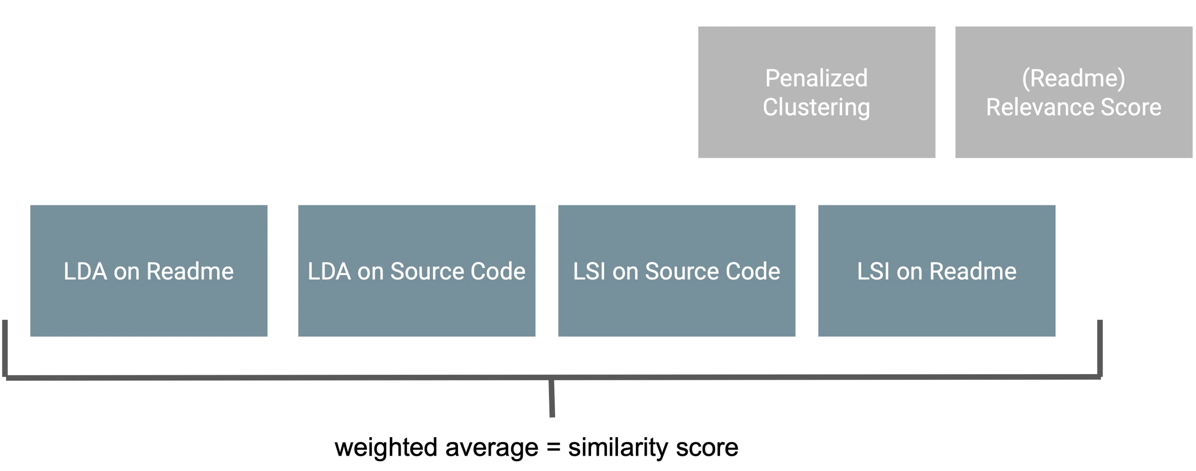
A short glimpse of what the end result looked like:
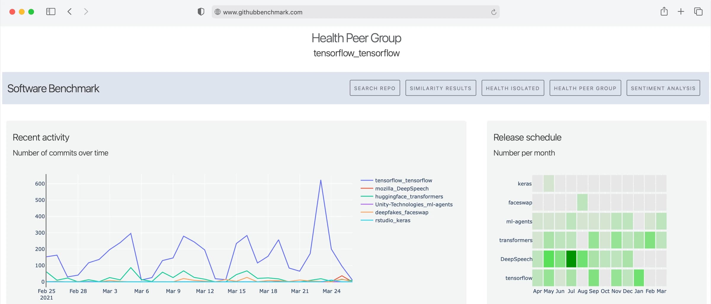
Approach: The work splits into three steps: a similarity search, a descriptive analysis and a prescriptive analysis. We considered over 1,000 repositories (more than 300 GB of data), made up of the 1,000 most-starred repositories on GitHub per programming language, plus a few projects we picked ourselves.
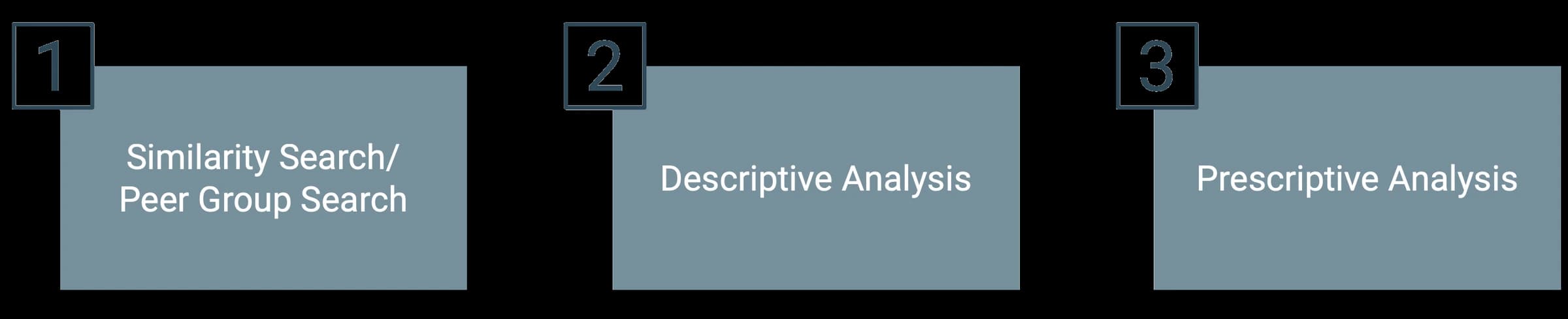
(1) Similarity search: To judge how similar two repositories are, we looked at both their READMEs, as a good summary of what a project is about, and the code of the repositories themselves. After a fair amount of preprocessing, we ran either Latent Semantic Indexing or Latent Dirichlet Allocation over both. For the code we used a sample of the files per repository, since scoring all of them would have been too expensive. That yields four scores, which we averaged into one.
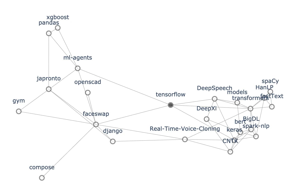
In the app you simply enter the repository you want analyzed. To give a broader view of its neighbourhood, we also render a force-directed graph across several skip levels, starting from the base repository, the darker grey dot.
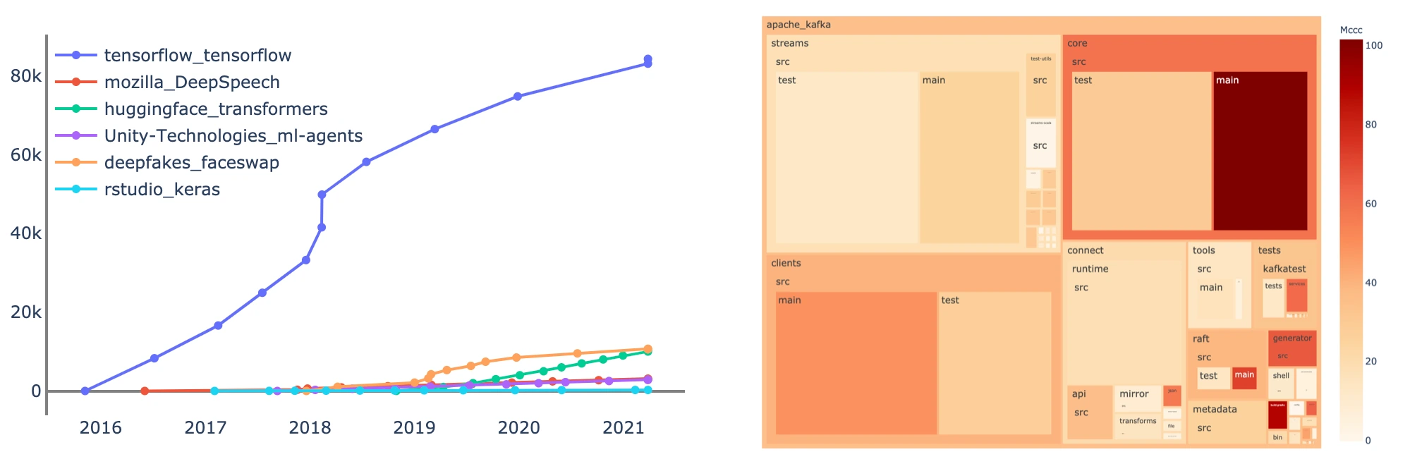
(2) Descriptive analysis: Once the peer group is fixed, the repository can be compared against the other peers in that group: stars, contributions and forks over time, the release schedule, and the distribution of comments and lines of code. We also built a dynamic treemap whose colour can encode, for instance, the McCabe cyclomatic complexity (McCabe, 1976) across files or parts of the repository, a common proxy for how complex and how readable code is.
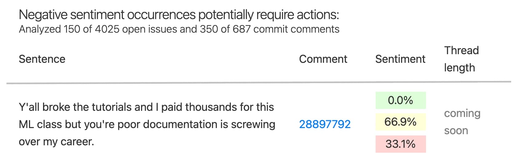
(3) Prescriptive analysis: In a large project, communication and collaboration run through PRs, issues and comments. That is also where friction surfaces first: someone stuck on a problem, a disagreement that keeps going, a thread heading for escalation. So we ran a sentiment analysis over commit comments and the comments on open issues. We used VADER from NLTK, a rule-based model built for social media language. That fits better than a conventional AI model trained on ordinary prose, because issue threads are written the same way: short, with emoji and a lot of punctuation.
What gets scored is not the comment but each sentence on its own. A long, matter-of-fact bug report with one very negative clause in it would otherwise disappear into the average. To keep stack traces, logs and code blocks out of the sentiment analysis in the first place, a crude filter runs ahead of it: a sentence is only scored if it has at least three words, is more than 80 percent alphanumeric characters and contains no token longer than 20 characters.
The example below comes from the TensorFlow repository.
The stack: The whole project is Python: a Python backend for the analysis and Flask for the website, with Dash for the interactive charts, Plotly for rendering and networkx for the force-directed graph.
Inside the analysis sit spaCy for lemmatisation, NLTK for stopwords, gensim for LDA and LSI, alongside scikit-learn and nimfa. The repositories were cloned with GitPython, the metadata fetched with PyGithub, and the run orchestrated with Metaflow.
Summary: The project ran for roughly one semester, and there were only two of us. Other master's projects were staffed with four or five people. Against that background I am very happy with what came out of it. Working together was a lot of fun too, despite how limited the options for actually meeting were during the Covid lockdowns. What came out of it spans data acquisition, preprocessing and the analysis of more than 300 GB. That data is the reference corpus: any repository you want to look at can be compared against it, and the result can be viewed in our web app.